13 Expert Tips For Landing Page Success

A landing page is a website that consists of a single page that focuses on one action and one action only. Often, landing pages are reached through dedicated campaign banners, pop-ups or ads. Common landing page goals include:
- Subscribe to a newsletter
- Sign up for an ebook
- Leave your details to get a quote
- Stay informed about new products
- Apply for a discount
In all of the above situations, site owners want visitors to take action and be converted from an anonymous visitor to someone who is registered and known.
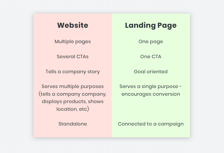
Websites and Landing Pages – What’s the Difference
While the basic principles of good web design apply to both websites and landing pages (for example, they must both load quickly and look great on all devices), there are several ways in which landing pages fundamentally differ from multiple-page websites.
To help you build landing pages that do their job and do it well, we’ve put together a 13-point checklist to guide you in both design and content. So without further ado…
13 Things to Remember when Designing Landing Pages
1. Make them readable at a glance
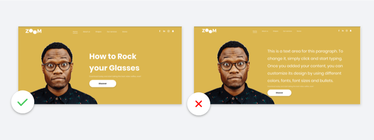
Landing pages need to be easy to read, fast. Visitors must understand, in a moment, what you want them to do. The title should be direct and clear, written in a font that is attractive and easy to read.
- Use short words. Humongous ones are harder to read, don’t you think?
- Keep sentences and paragraphs short.
- Place the CTA above the fold.
- Don’t be afraid of empty spaces and big fonts.
2. Communicate value – “What’s in it for me?”
The single most important thing about a landing page is the value that it communicates. Visitors need to know what’s in it for them . For example, if they download a pdf or fill in a contact form, what will they get out?
While you want to keep landing page text short, you still do want content on the page. Content that explains what users will get from conversion and that lends a sense of trustworthiness and authority.
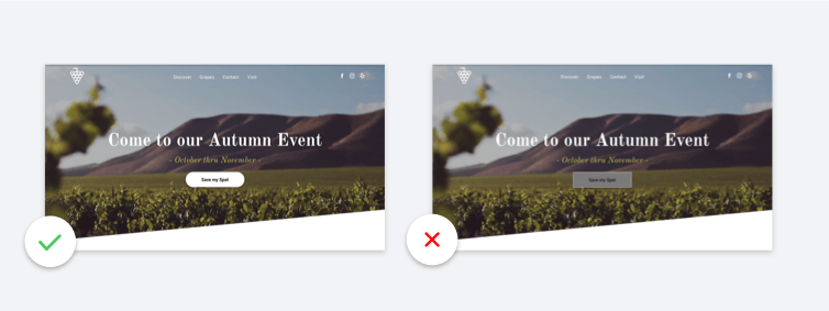
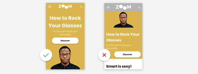
3. Keep key information above the fold
Make sure that the most important information on the page (generally the header and the button) are visible right from the start – double check how things look on mobile.
4. Contact forms that are just the right size
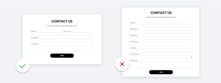
Contact forms are a valuable tool for collecting information and often used in landing pages. If you use them, make sure they have just the fields you need to achieve the page goals – no more and no less. In other words, don’t ask users for their fax number, birthday, or mother’s maiden name unless you really need it to for conversion.
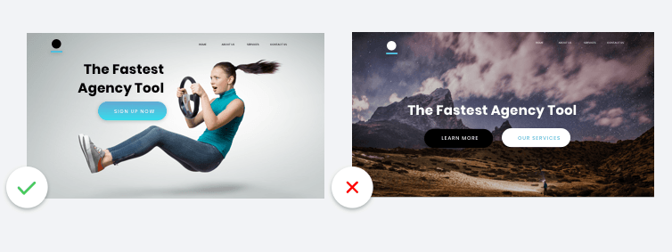
5. Use great RELEVANT images
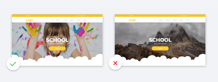
Websites always need to have high-quality images, but in landing pages, relevance is also of great importance. After all, you don’t have a whole lot of room in a one-pager, so choose your images wisely and make sure they relate to the landing page’s theme and goal.
6. Design for conversion
Since landing pages have one goal and one goal only (conversion) all design elements should support this goal. For example, the reading flow should lead to the CTA or contact form, and visual elements such as arrows and lines should also guide visitors in this direction. The CTA should be visible right from the start, so visitors don’t have to scroll to see it.
7. One button = one message
Landing pages want visitors to take a single, specific action. Don’t dilute the impact of a single CTA by adding a second or third one. Such a move may confuse visitors or steer them in a direction that differs from that of the landing page, thereby reducing conversion.
8. Use a CTA that zings
Submit, Download and Contact Us are all good CTAs, and fine for many landing pages. But if you can come up with a CTA that packs a punch, zings on the screen, and encourages visitors to click as they’ve never clicked before, use it.
Of course, your CTA shouldn’t be so clever that visitors don’t know what you want from them. However, if you can come up with something that’s both clever and clear, go for it!
9. Make the button color POP!
10 . Optimize for SEO
Every site you build should be optimized for SEO, and landing pages are no exception. Making your landing page SEO friendly helps attract visitors, which boosts the opportunity for conversion.
Elements such as page speed and mobile responsiveness are already taken care of in all landing pages built on Duda, and you can easily add title tags, image attributes, etc., via the editor.
11. Keep headers, footers and navigation focused
When it comes to website headers , footers and navigation, minimize the number of links that distract from the page’s goal. For example, include elements such as copyright, logo, site credits, and social media links, as they add authority and can be helpful. Think twice before including links to unrelated site pages, blogs and support articles, as they can distract.
12. Use sections, in moderation
Sections are a great way of separating ideas on a page but don’t go overboard when it comes to landing pages. Too many sections may cause visitors to scroll too far and lose sight of the page’s purpose.
13. Double check on mobile
Ready, set, convert!
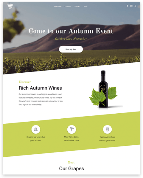
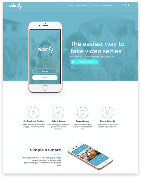
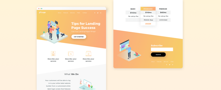
Here are some gorgeous examples you can start with: